These are the R packages that I will use to read and plot the data
Read the data in from Part I
Interactive Graph
Start with
consumptionTHENUse
mutateto pasteYearas a character androundOunces to 1 decimal place THENUse
group_byto group byCountryTHENUse
e_chartsto selectYearas the object on the x-axis THENUse
e_lineto add a line to the variableOunces- Set
legendto FALSE to remove legend from plot
- Set
Use
e-tooltipto add a tooltip that will display based on axis values THENUse
e_titleto add a title, subtitle and link to subtitleUse
e_themeto change the theme todark-fresh-cut
consumption %>%
  mutate(Ounces = round(Ounces, 1),
         Year = paste(Year, sep = "-")) %>%
  group_by(Country) %>%
  e_charts(x = Year) %>%
  e_line(serie = Ounces, legend = FALSE) %>%
  e_tooltip(trigger = "axis") %>%
  e_title(text = "Alcohol Consumption from 1890 to 2014 for High Income Countries",
          subtext = "In Ounces, Source: Our World in Data",
          sublink = "https://ourworldindata.org/alcohol-consumption",
          left = "center") %>%
  e_theme("dark-fresh-cut")
This graph displays the alcohol consumption per capita for High Income Countries from 1890 to 2014 in Ounces.
Static Graph
Start with
consumptionTHENUse
filterto extract data fromThe United StatesTHENUse
ggplotto create a plot with data THENUse
geom_pointto add pointsassign
Yearto the x-axisassing
Ouncesto the y-axis
Add a line with
geom_smoothassign
Yearto the x-axisassing
Ouncesto the y-axis
Use
labsto:set subtitle to
Alcohol Consumption for The United States in Ounces from 1890 to 2014set
xandyto NULL so the x and y axis won’t be labeled
Use
theme_test()to set the theme
consumption %>%
  filter(Country == "United States") %>%
  ggplot() +
  geom_point(aes(x = Year, y = Ounces)) +
  geom_smooth(aes(x = Year, y = Ounces)) +
  labs(subtitle = "Alcohol Consumption for The United States in Ounces from 1890 to 2014", x = NULL, y = NULL)+
  theme_test()
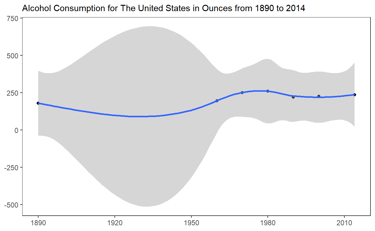
Alcohol consumption in The United States of America has been steadily increasing by a few ounces year over year since 1890. Data from 1920 does not exist due to Prohibition.